Design Systems, Prototyping, Visual Design, Branding
AirOregon Design System
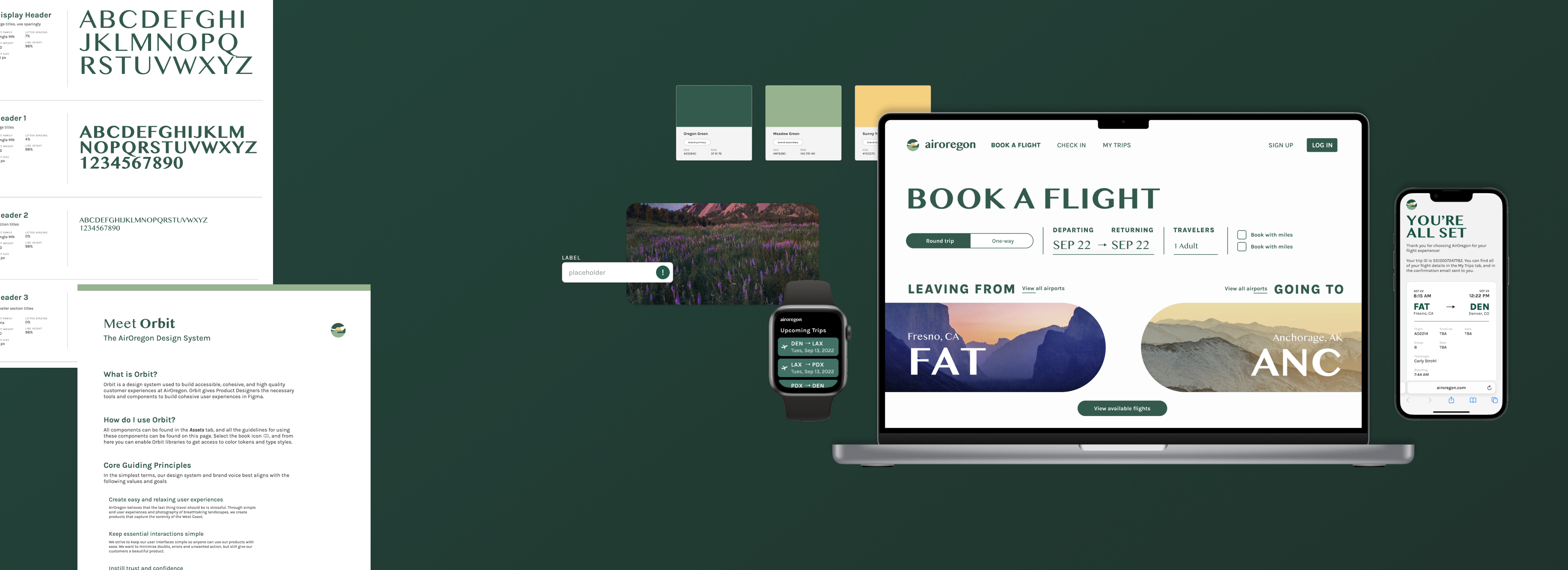
A brand identity and robust design system built in Figma that's goal is to aid in the creation of user interfaces and experiences for AirOregon's digital prodcuts.
BACKGROUND
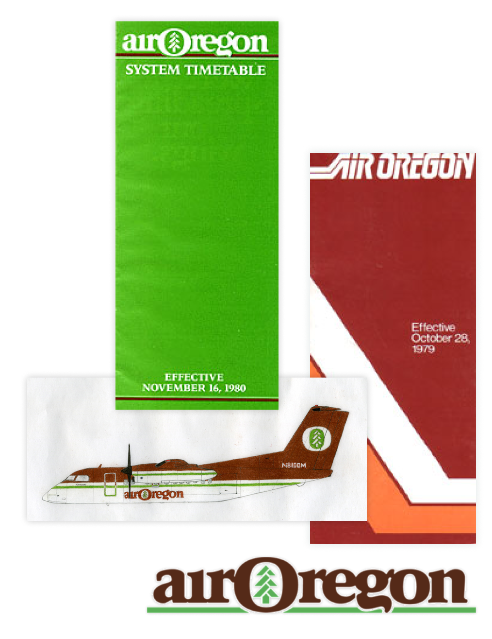
Air Oregon was a West Coast regional airline that began in 1978 under the name Executive Flight Services. Into the early 80s, they underwent many name changes and mergers. but eventually ceased operations in 1982. Now more than 40 years later, they are looking to undergo another re-brand. They need an intuitive design system that establishes the brand and can be used by designers and engineers to build the airline's new digital products.
THE PROBLEM
There is an opportunity to create a brand identity and design system that can be used to build accessible, cohesive, and high quality customer experiences at AirOregon.
The Solution
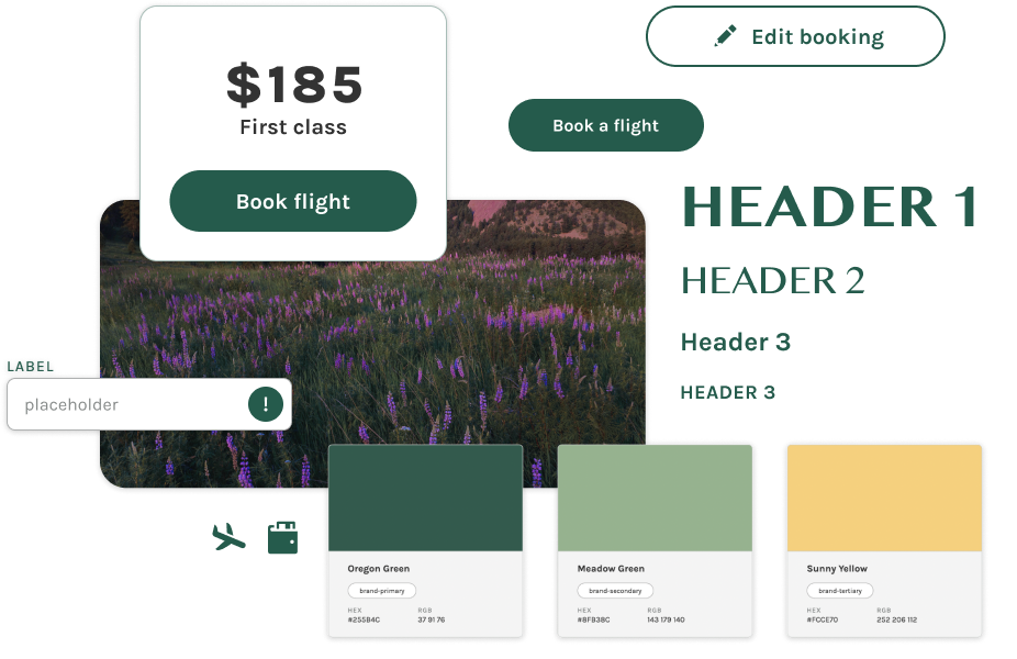
I created a new brand and design system for AirOregon that included UI components and guidelines for typography, accessibility, photography and more.
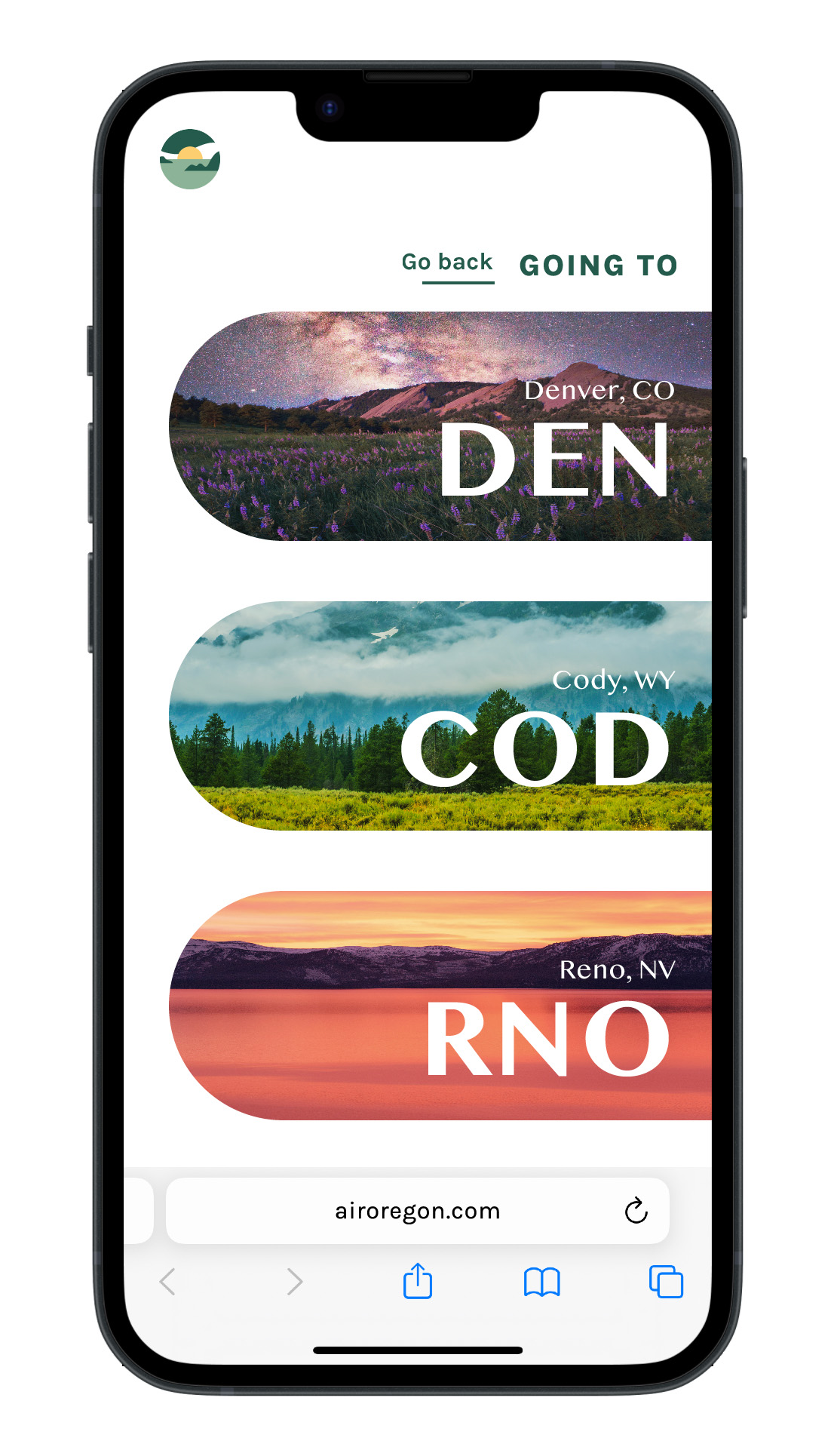
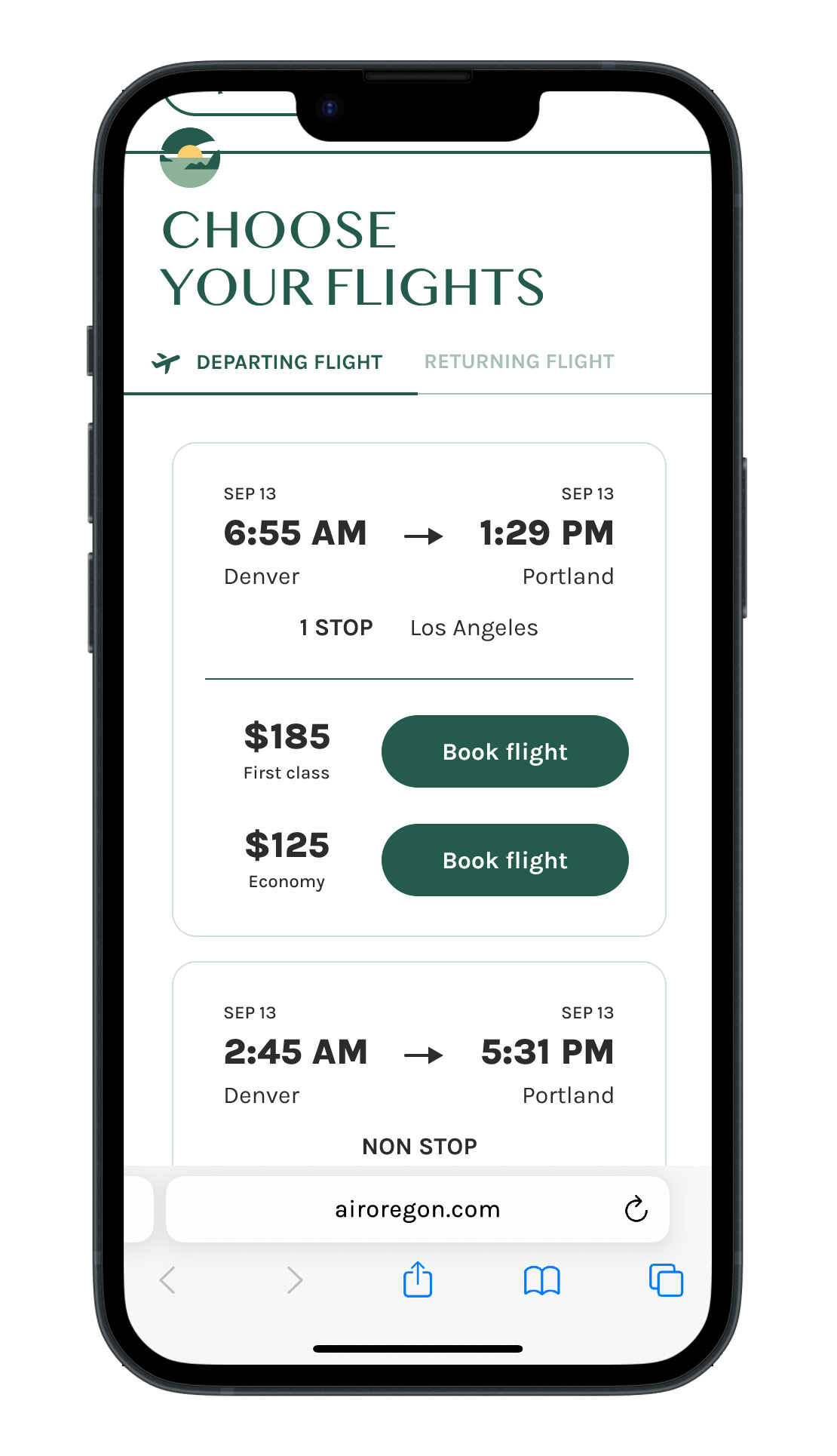
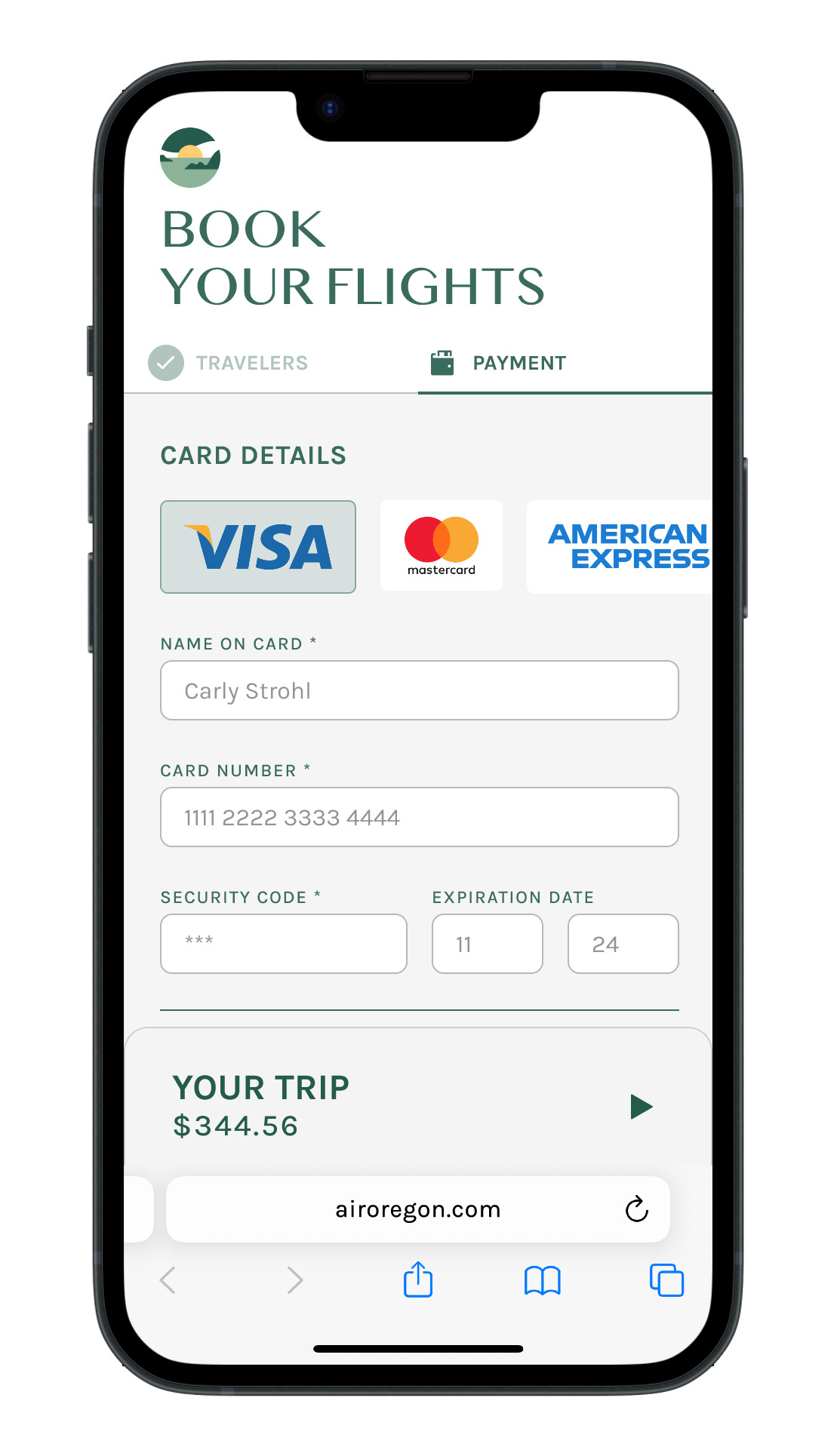
I used the design system to streamline my original designs and build prototypes for mobile, web, and smart watch to demonstrate one example of a user experience at AirOregon.
Organization
A design system is an extensive resource that only becomes larger and more complex over time, so designers need it to be organized and easily navigable. I created a database that links to all the components and design guidelines so designers can optimize their workflow and limit the amount of time searching for something specific.
Color Tokens
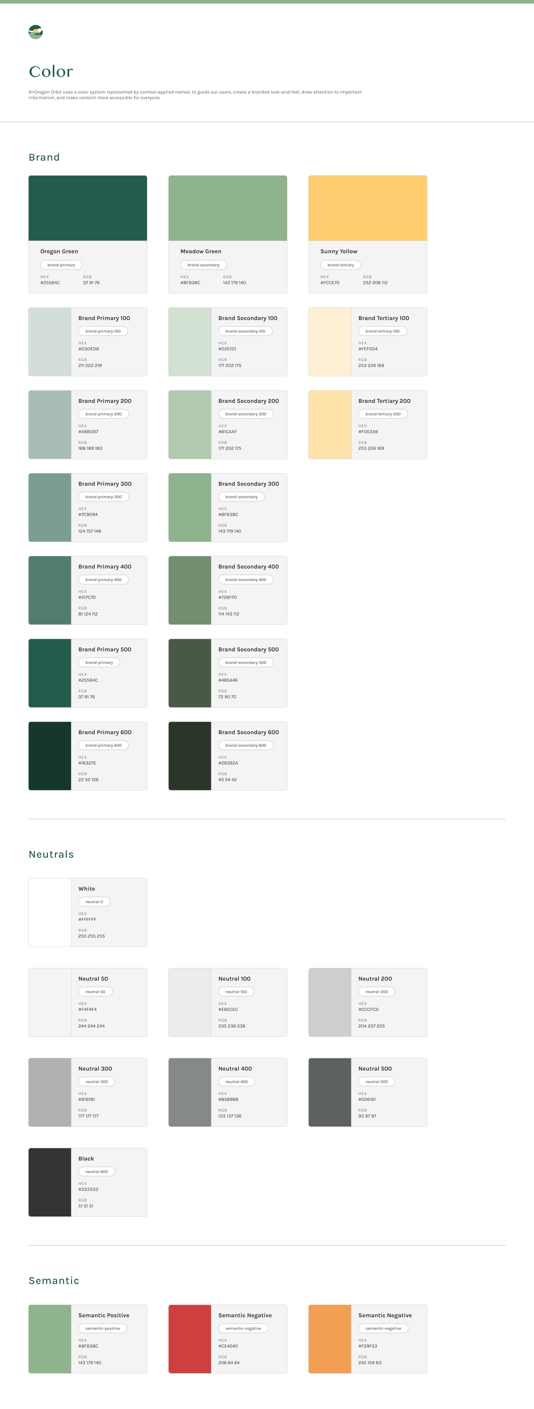
Color is a powerful brand indentifier that helps provide contrast and define hierarchy to guide users. The color palette I created maintains unity across all of AirOregon's products.
Design tokens represent the small, repeated desing decisions that make up a design's system visual style. They replace static values, like hex codes for color. Tokens are essential to a successful design system because they are reusable and style updates will propogate consistently through any given product.

Components
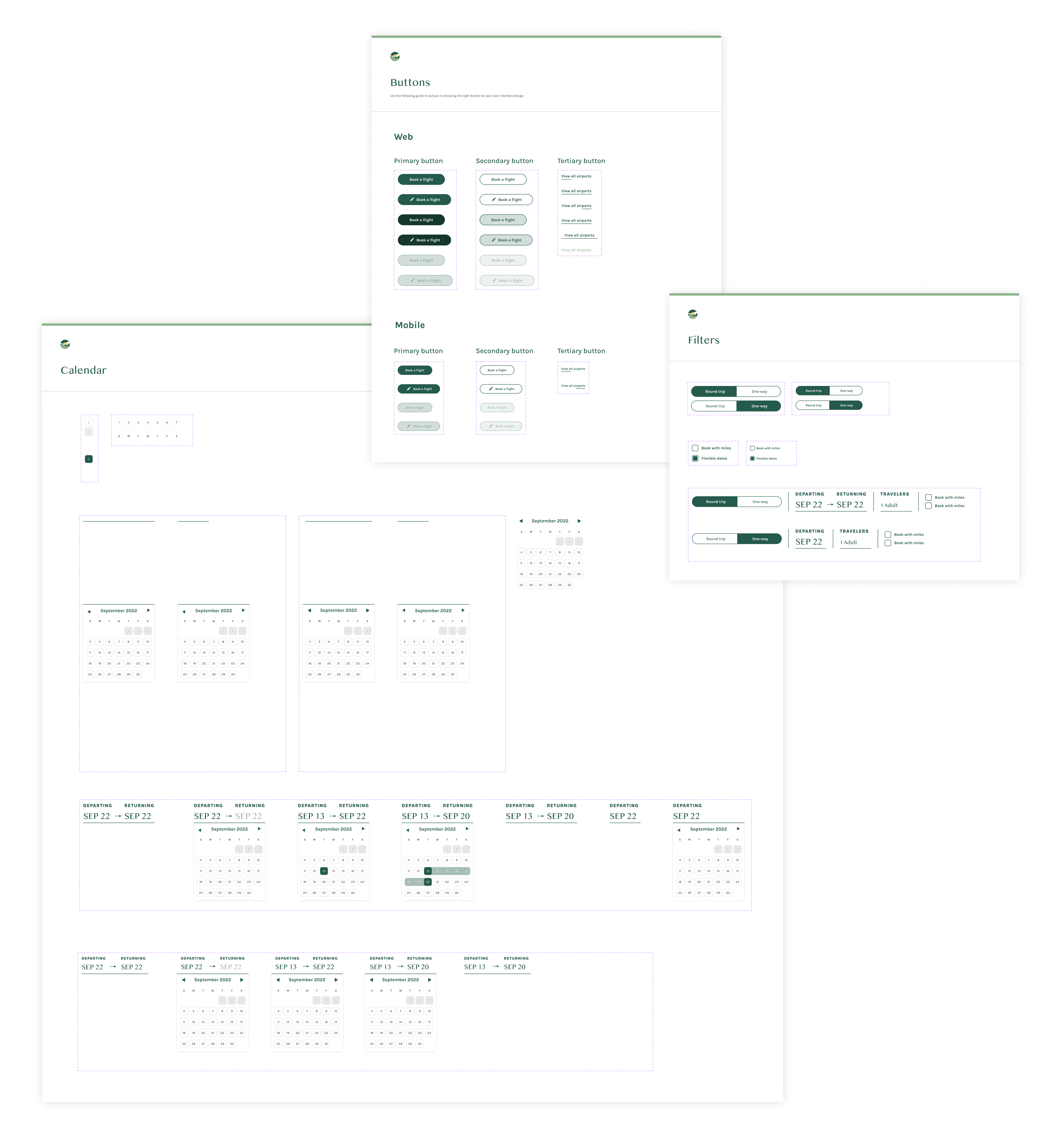
Components are the building blocks of a user interface, so the component library for Orbit needed to be comprehensive. I created Figma components for the smallest atoms like buttons and check boxes, to detailed organisms like the calendar date select.
Mobile Prototype
Made in Figma
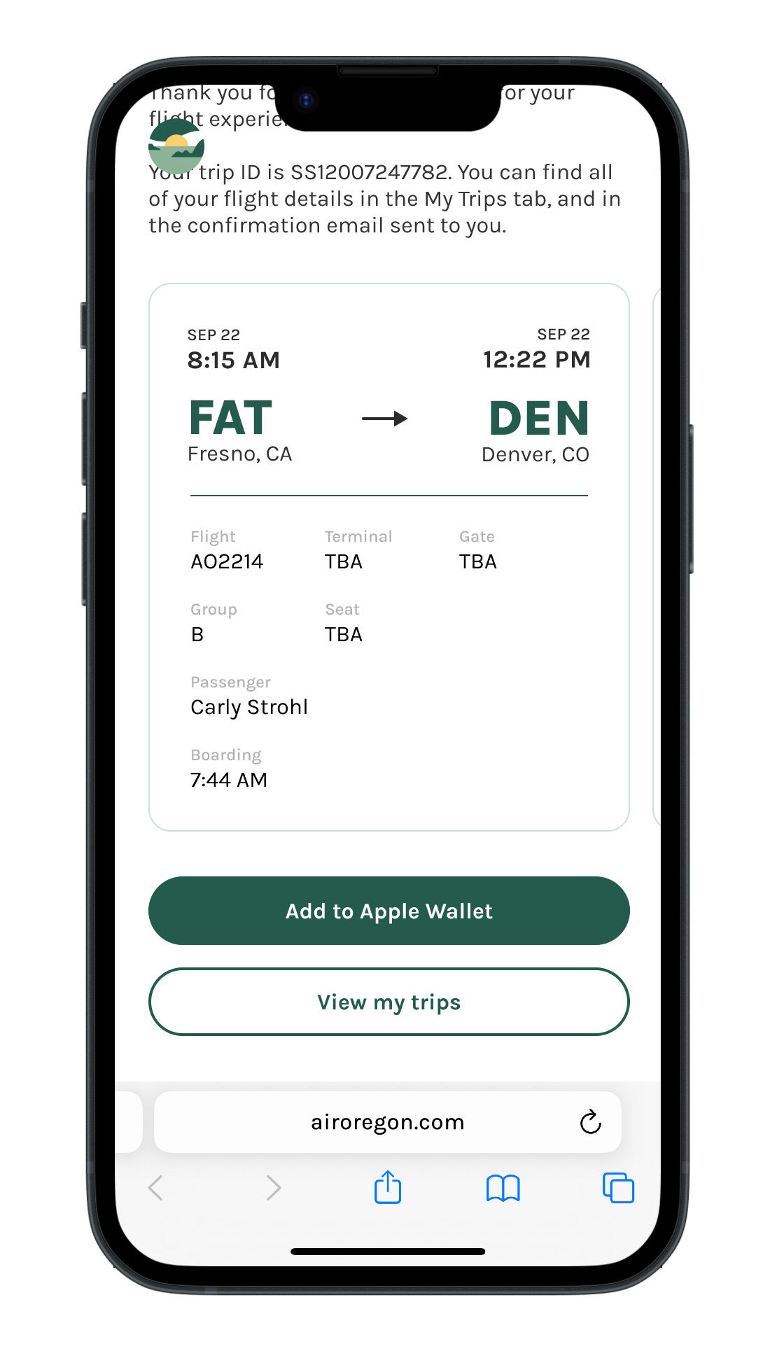
Desktop Prototype
Made in Figma
TAKEAWAYS
Design systems are a constant work in progress.
Rules set by the design system are not set in stone—they should always be open to iteration to allow for products to evolve and improve.
Design systems are a source of truth for a product team.
Although I did not work on a product team, Orbit is structured so that anyone can design a product from the guidelines and libraries I created. Having a single shared design system allows teams to create coherent and consistent user experiences without needing to reinvent the wheel.
Design systems should evolve with evolving technology and tools.
Throughout my time working on this project, Figma added multiple new features like component properties and nested prototyping. As the tools we use to design improve, so should our design process. I plan on updating my existing design system with Figma's new features to keep my designs up to date with the industry standard software.
See more of my work
Digital IllustrationIllustration
Plant Parent Login StudyUI Design
No Kill MagazineSocial Media & Editorial Design
NewRetirement Audience Expansion SolutionWeb Design, Marketing

Ex-Tumblr GirlsBranding Design
