Web & Mobile Design, User Flows, Wireframing, Prototyping
Plant Parent Login Study
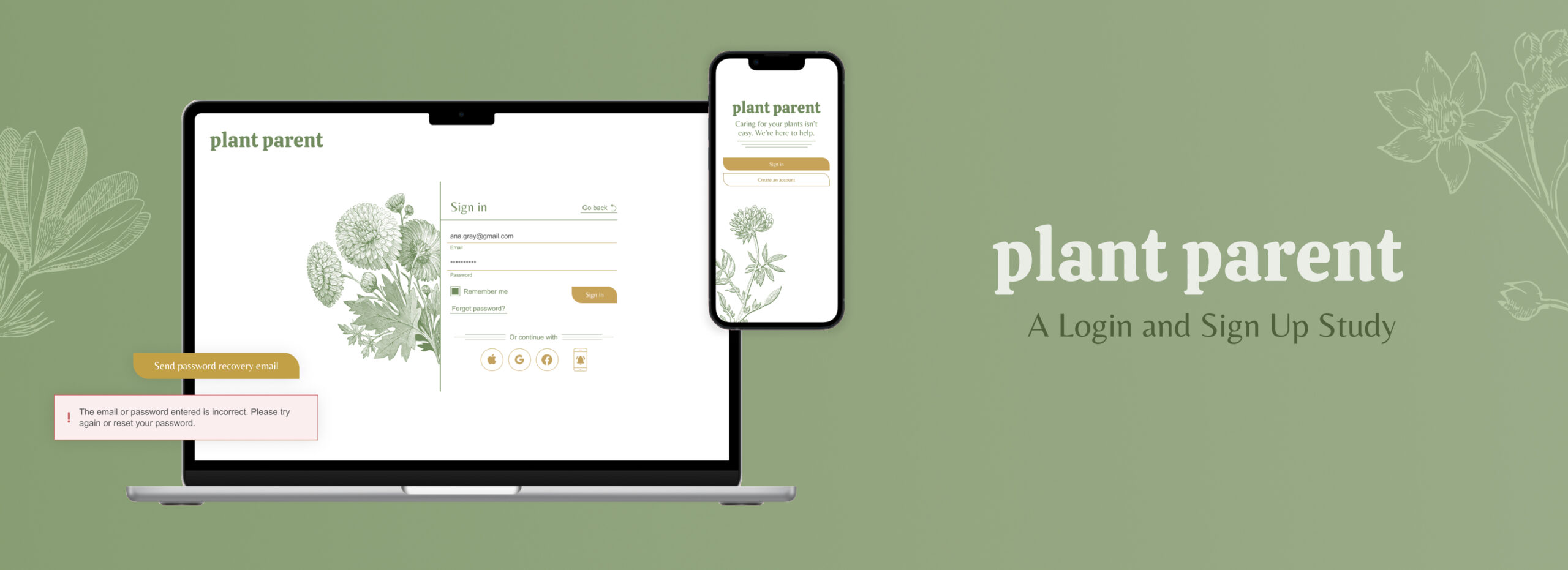
This project is an exploration of interaction design concepts by defining and developing workflows and mock-ups for a log in scenario. I created the brand Plant Project to produce high level assets and communicate the main interactions used in a login process.
Overview
Creating an account and logging in are often the first interactions users will have before using an application. For an optimal and positive user experience, the login and sign up process needs to be clear, intuitive, and secure.
The login page and process is the first experience for a user for any given application. Keeping this interaction simple and straightforward will set the stage for the rest of the user's interactions with this product.
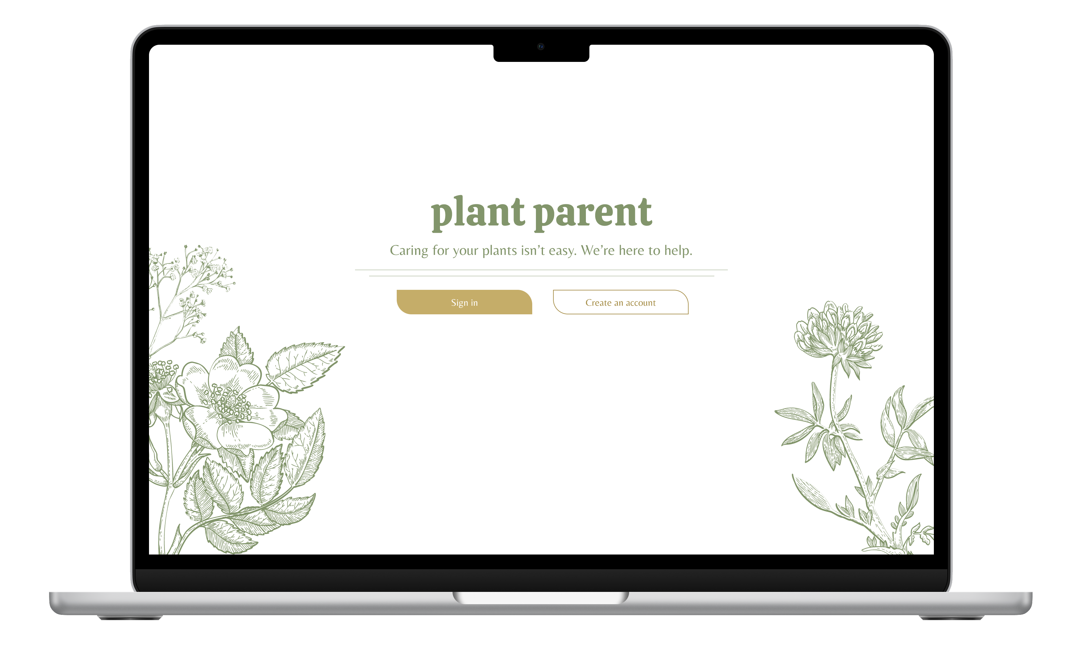
WELCOME PAGE
Why does this state exist for the user?
To introduce the user to the product
What messages are displayed to the user?
Logo and name of the website or application, short copy or slogan to introduce the product
What is the UI asking of the user?
Do you want to log in or create an account?
What are actions the user can take?
Log in, create an account
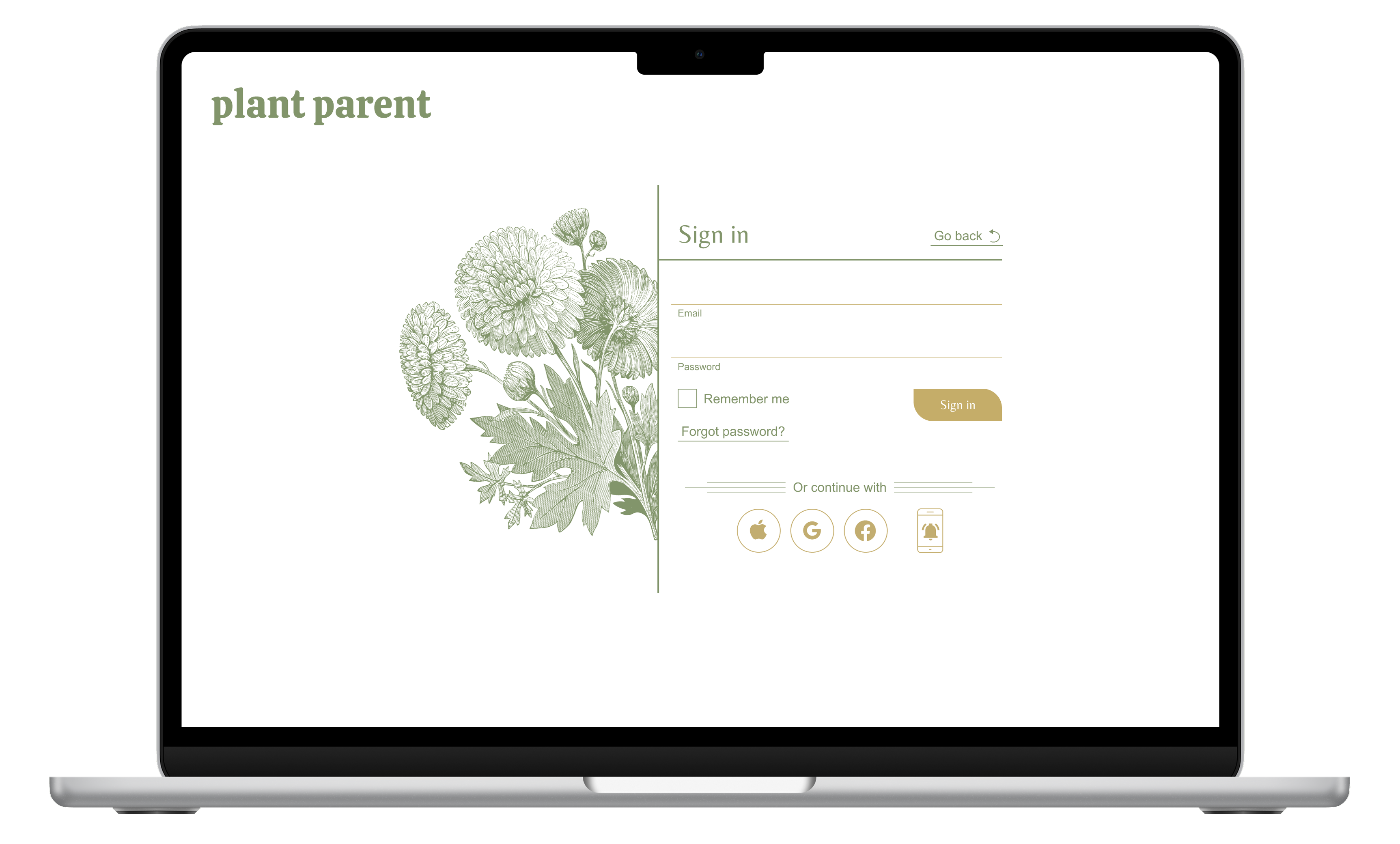
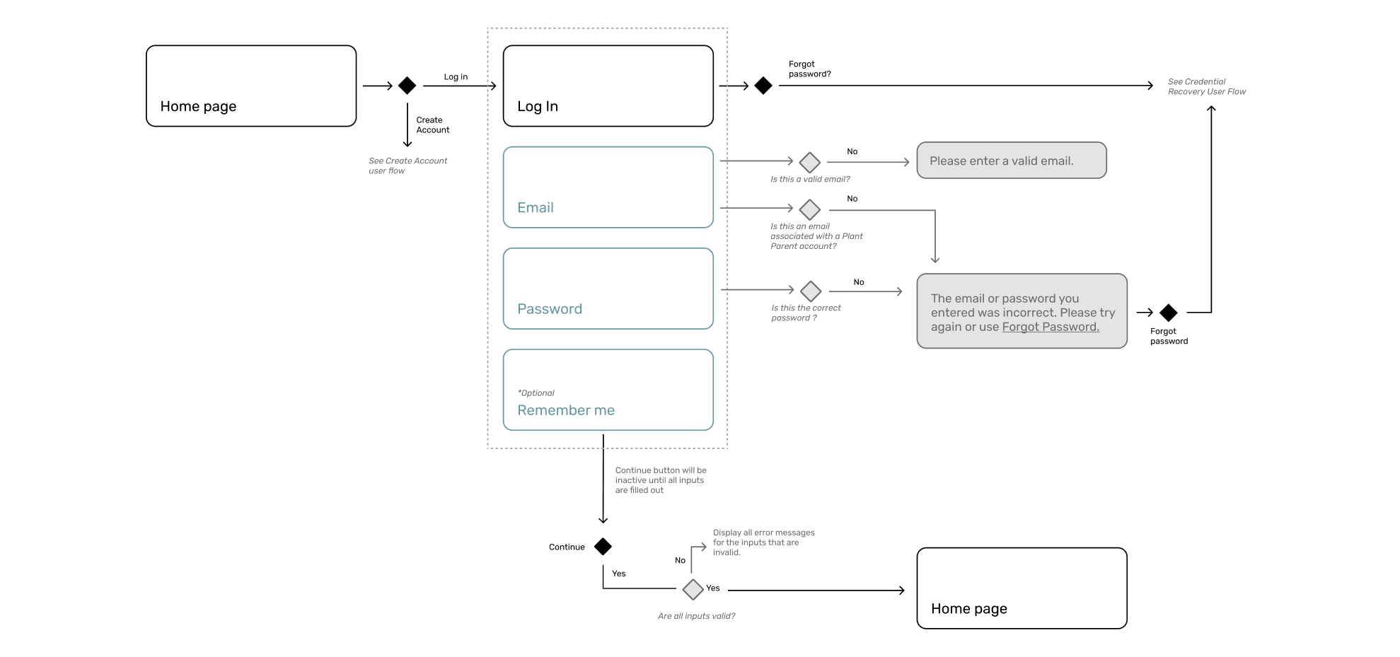
LOG IN
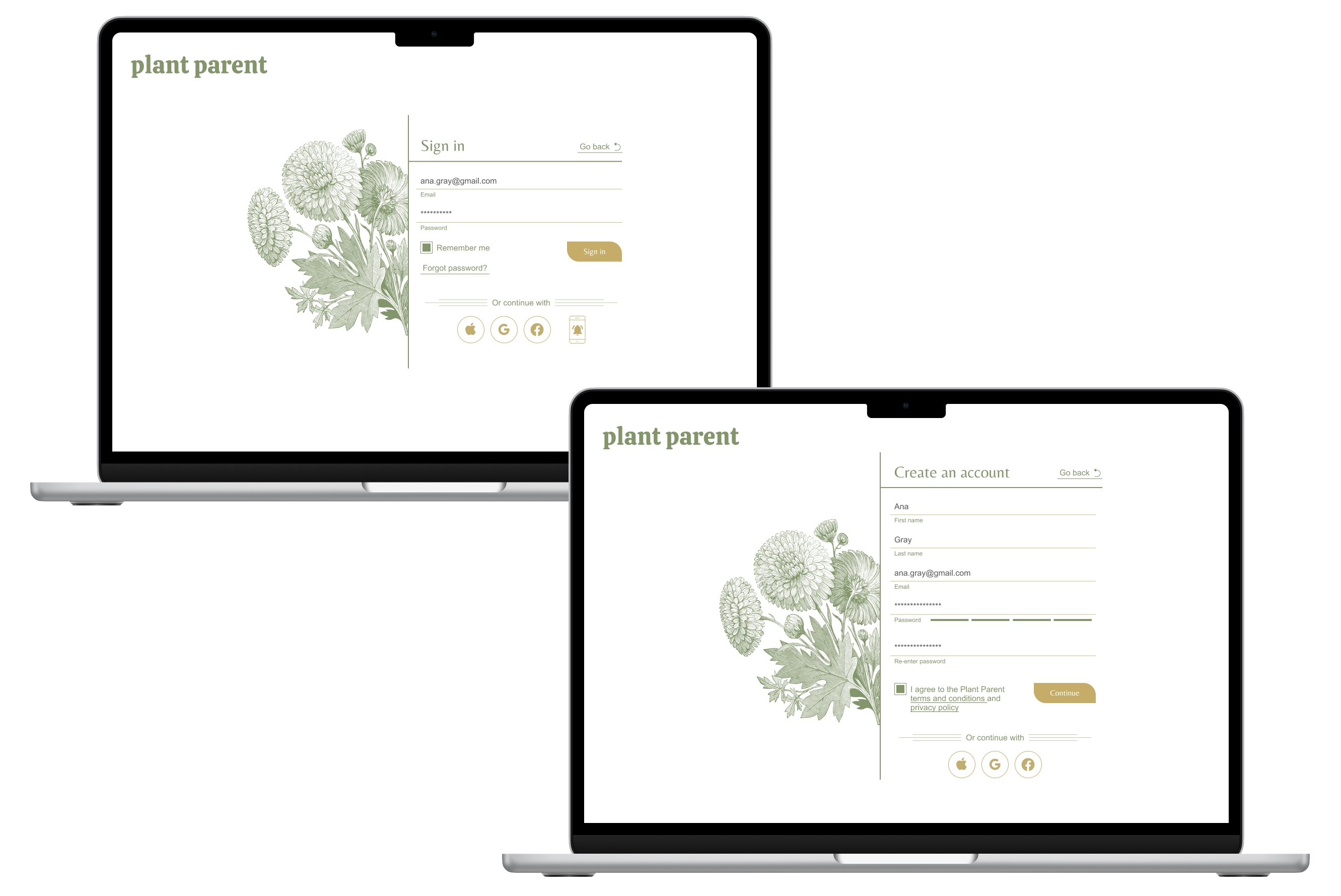
Why does this state exist for the user?
To allow a returning user to access their account
What messages are displayed to the user?
Log in title, labels for input fields
What is the UI asking of the user?
What are the credentails to access your account (email and password)?
What are actions the user can take?
Enter credentials, go back to welcome page, log in to application, remember log-in information, reset password if credentials don't work
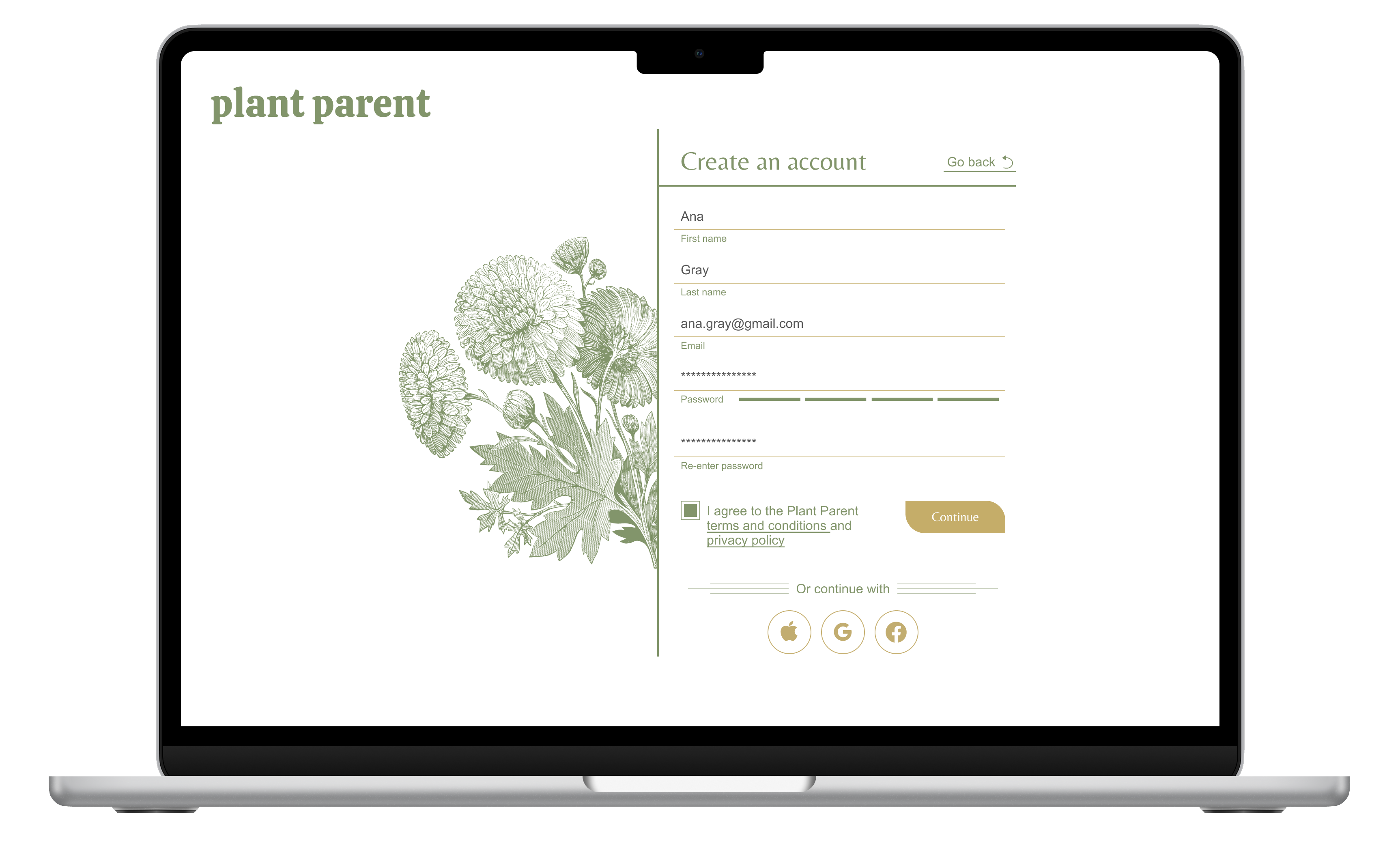
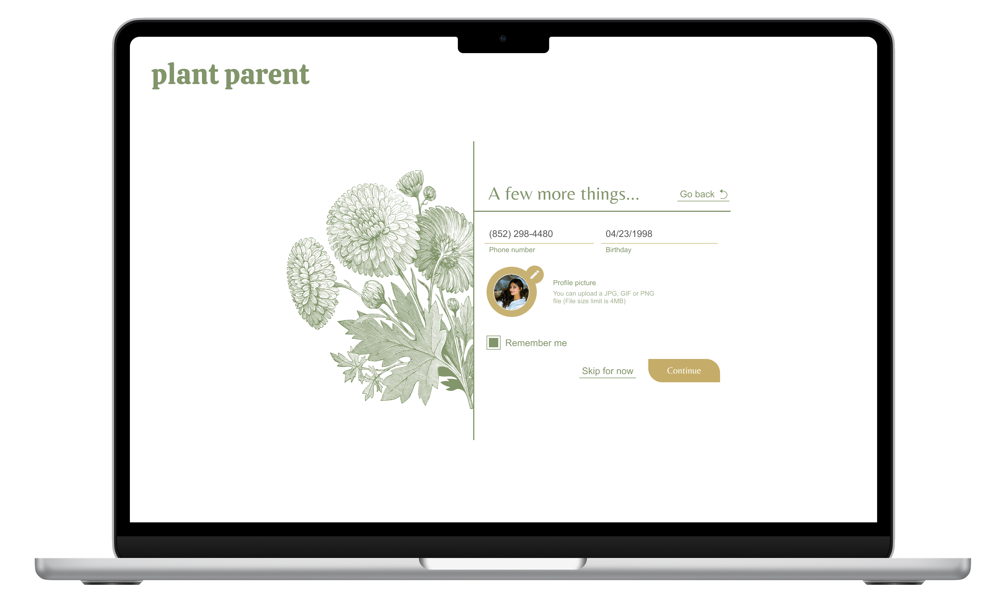
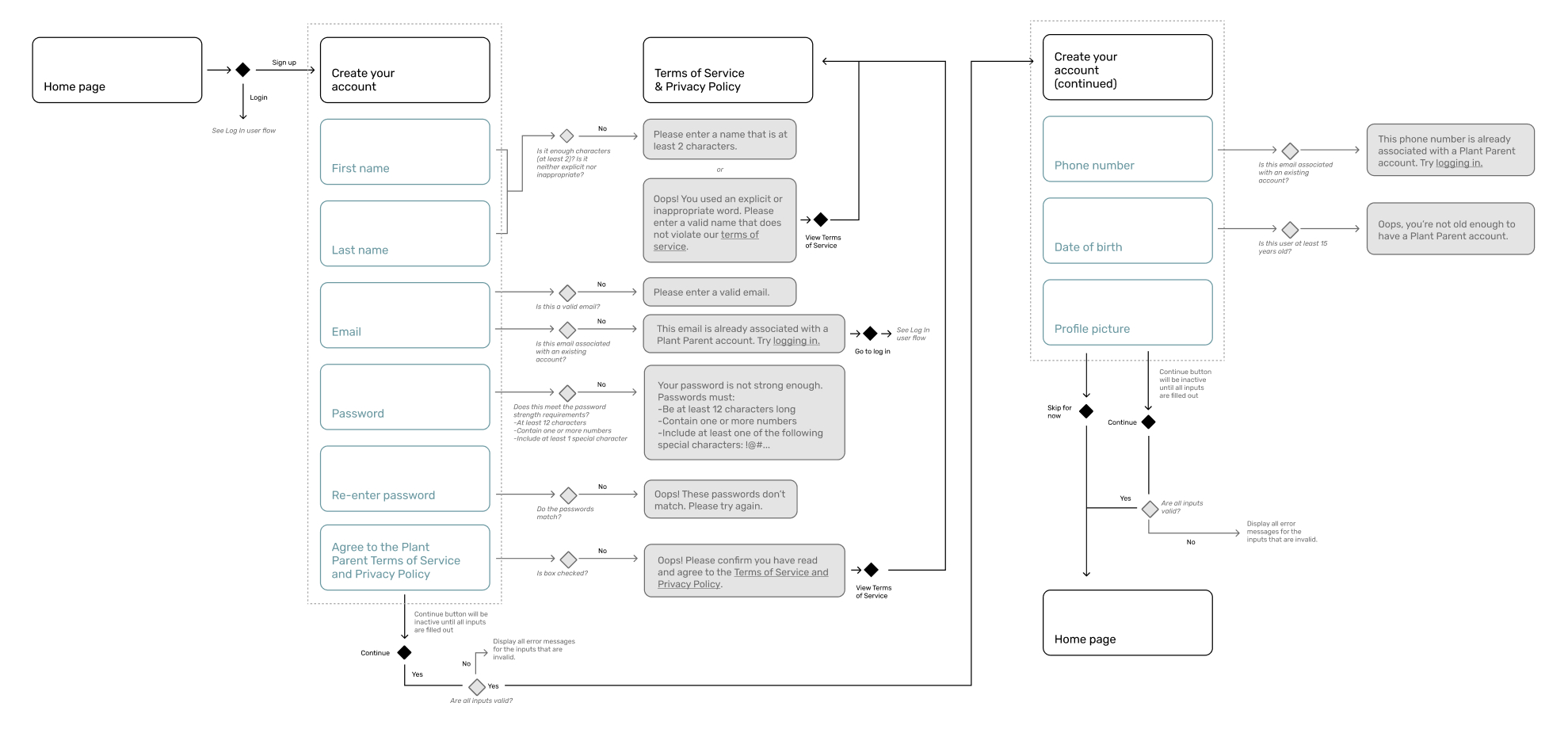
CREATE AN ACCOUNT
Why does this state exist for the user?
To allow a first-time user to create an account with the application
What messages are displayed to the user?
Create an account title, labels for input fields
What is the UI asking of the user?
What credentials do you want to use for your account (first and last name, email, password, phone number, birthday, etc)?
What are actions the user can take?
Enter credentials, go back to welcome page, continue to email verification
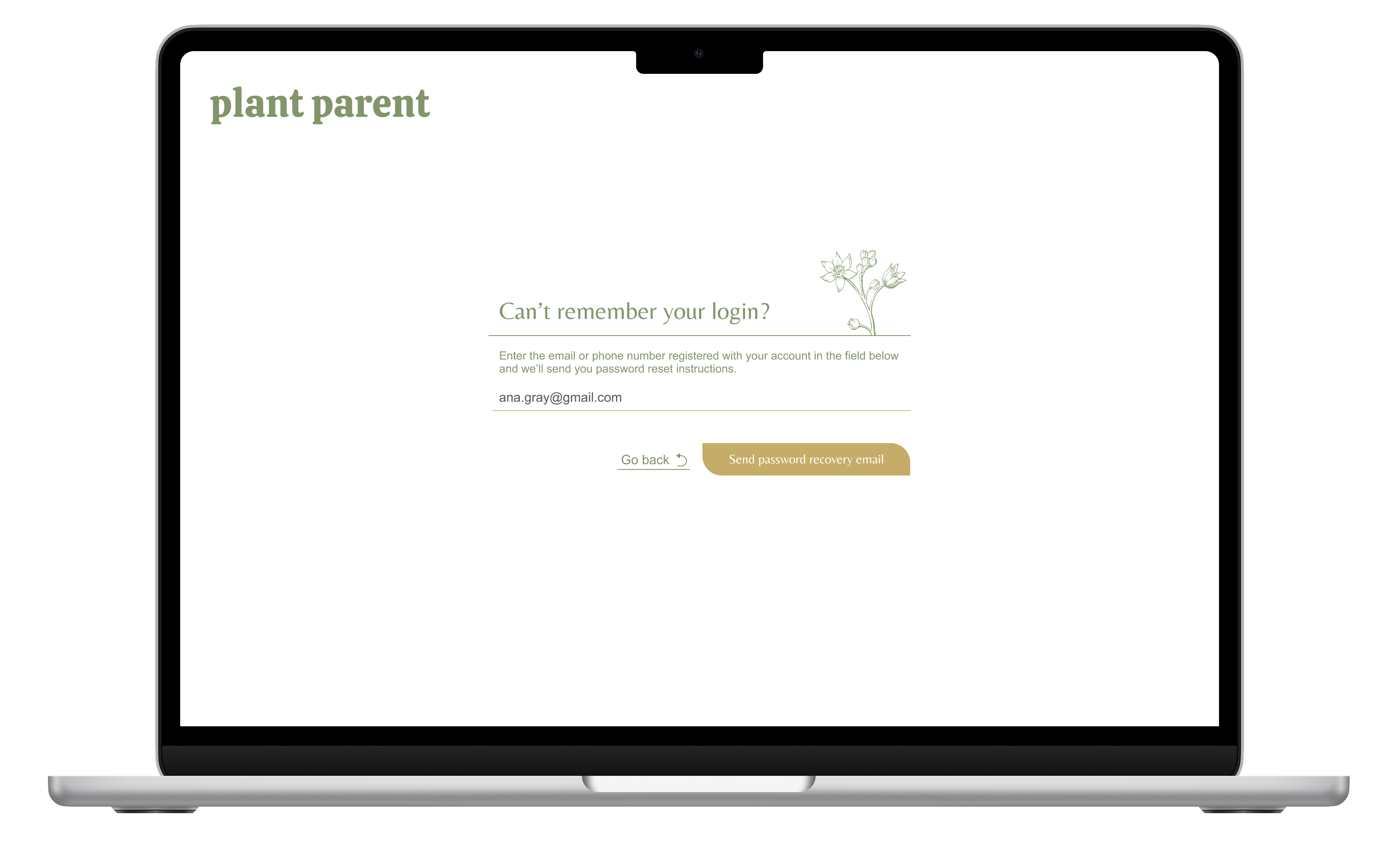
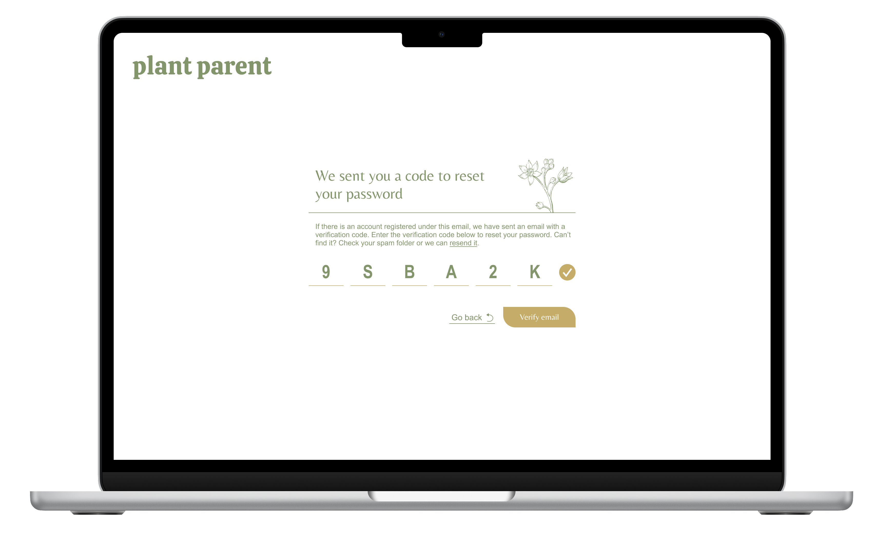
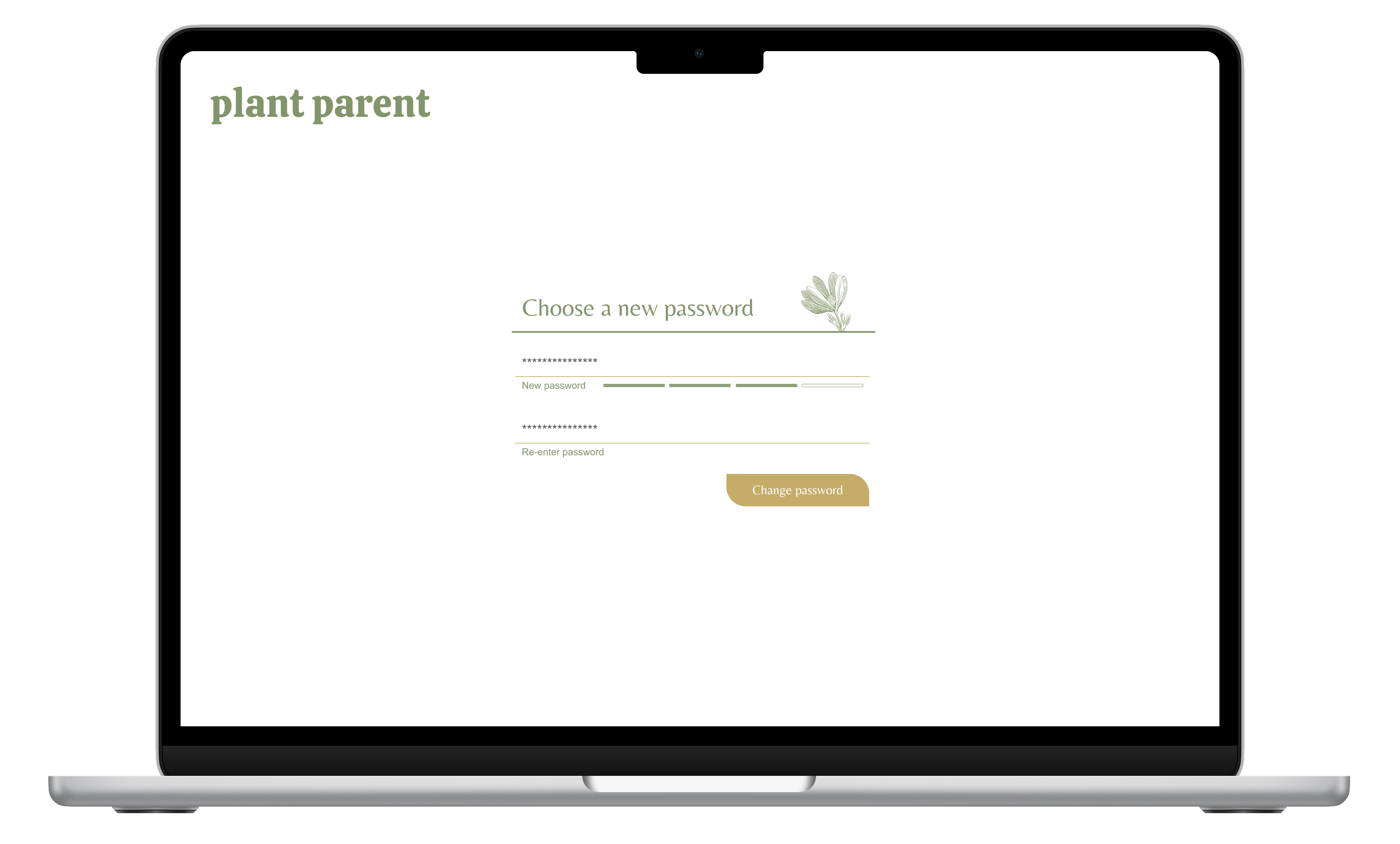
CREDENTIAL RECOVERY
Why does this state exist for the user?
For a user who has forgotten their login credentials to reset their password and choose a new one
What messages are displayed to the user?
Credential recovery title, labels for input fields, explanation on how to reset password
What is the UI asking of the user?
What credentials do you want to use for your account (first and last name, email, password, phone number, birthday, etc)?
What are actions the user can take?
Enter email or phone number, go back to welcome page, send password reset email, send again
USER FLOWS
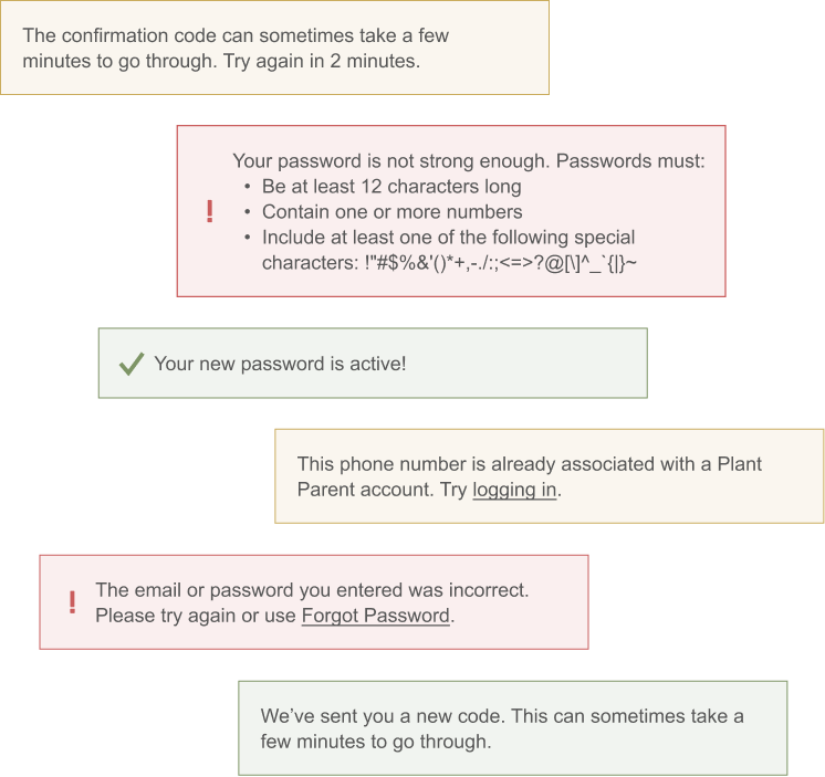
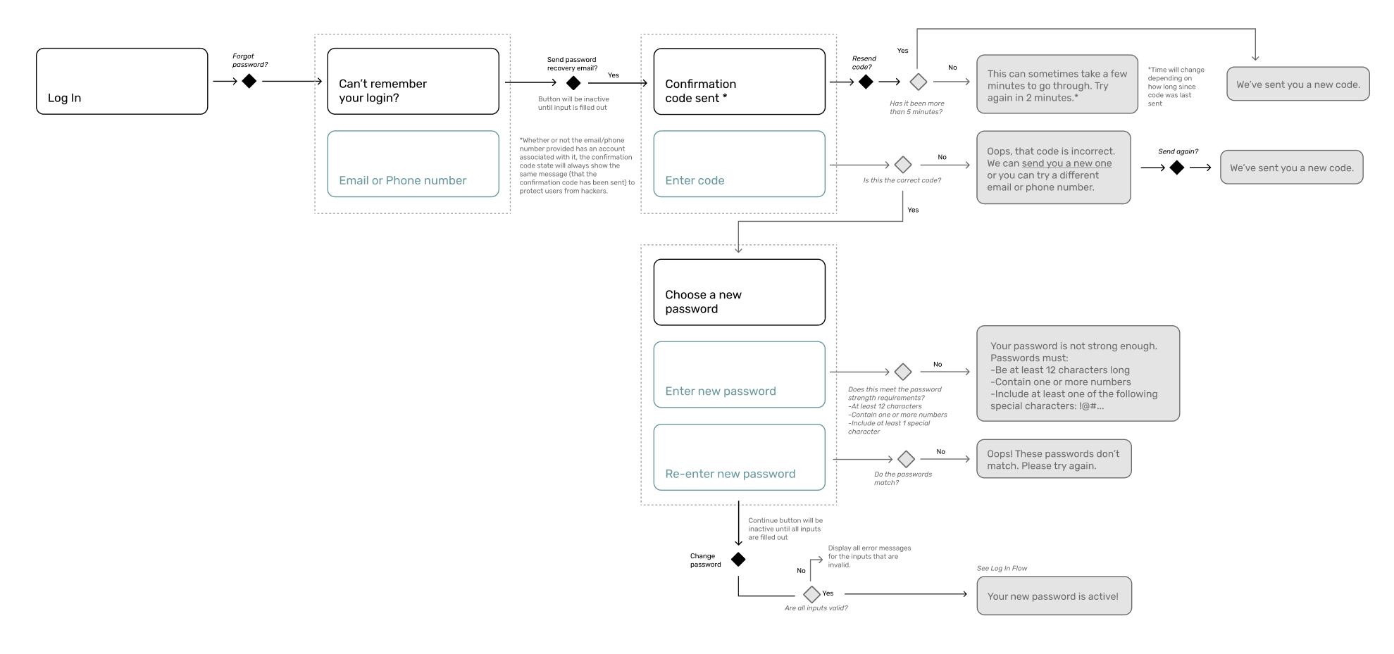
The user flows helped me deeply understand the user experience of logging in, signing up, and credential recovery. I broke down every possible interaction to make sure necessary system checks and feedbacks were in place and the user wasn't led into dead-ends.
TAKEAWAYS
Security is a design issue.
Although developers carry the majority of the responsibility when it comes to building secure products, design is also important for the security of a product. This can range from the requiring passwords to be entered twice, to choosing specific copy to deter hackers from accessing a user's account.
There's more to logging in than a username and password.
As I developed my user flows that detailed every step a user may take from the welcome page to accessing the website, I realized that users make a lot of mistakes. Designers shouldn't assume that the user will always take the correct path, but make sure that the user is always directed to a solution no matter what went wrong.
See more of my work

Digital IllustrationIllustration

No Kill MagazineSocial Media & Editorial Design
NewRetirement Audience Expansion SolutionWeb Design, Marketing

Ex-Tumblr GirlsBranding Design
AirOregon Design SystemVisual Design
