Marketing, Web Design, Prototyping, Data Visualization
NewRetirement Audience Expansion Solution
This is a solution for NewRetirement, a financial planning platform looking for an innovative way to market their product to a broadened audience,
ABOUT THE CLIENT
NewRetirement is a financial planning platform that gives anyone the ability to discover, create, and manage personalized paths to a secure future. They have built a successful business serving high net worth households who are focused on financial planning. My goal was to identify a way that NewRetirement can broaden its audience while staying true to its core brand and values.
THE PROBLEM
For many of those in the labor force, disability has affected their employment, budgets, and career and retirement plans. Yet they are left to fend for themselves when it comes to managing the extra finances that come with living with a disability. For many able-bodied individuals, disability may seem like something that can only affect the lives of other people. In reality, a 20 year old has a 1 in 4 chance of becoming disabled before they reach retirement age. Accidents, medical emergencies, and chronic illnesses can happen to anyone, and everyone needs to understand all the tools at their disposal to prepare for the unexpected.
There is an opportunity to provide people with disabilities with a path to financial empowerment that is informed by the realities of living with a disability.
The Solution
A white paper microsite provides useful information for people seeking to understand how disability can affect your finances and life plans. Traditional white papers are often dry and outdated in a digital world, but a brand-specific microsite can turn data visualization into an educational and exciting user experience.
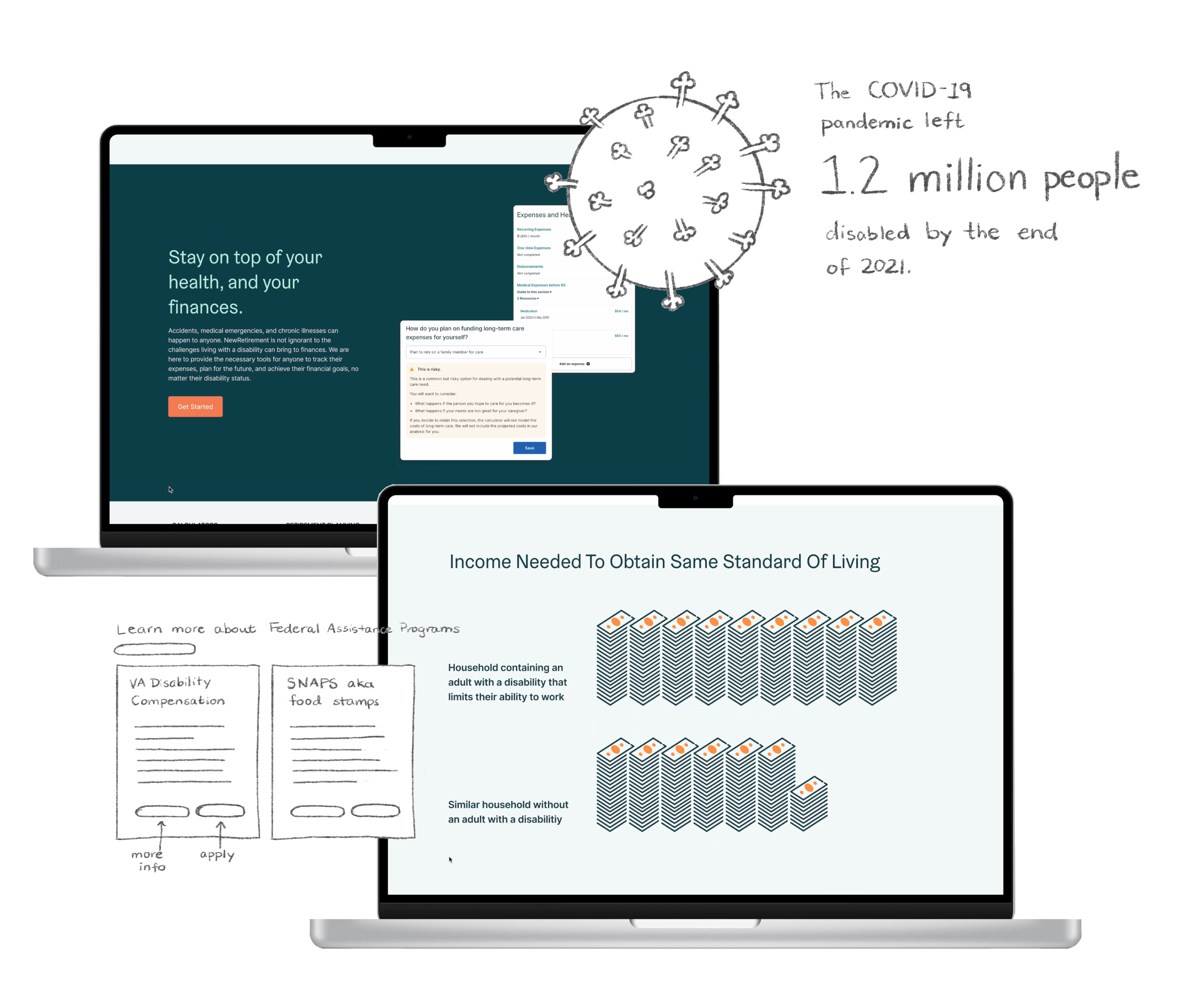
The first thing I wanted to highlight in the white paper was this COVID-19 statistic. I made a simple illustration to visualize this data point.
I used research from qualitative interviews to create a carousel of the different experiences that exist within the disabled community.
I visualized data about social security income in an animated bar graph to show how little money people get through SSDI payments. Visualizing the data in this way highlights the inequalities that may affect someone's finances.
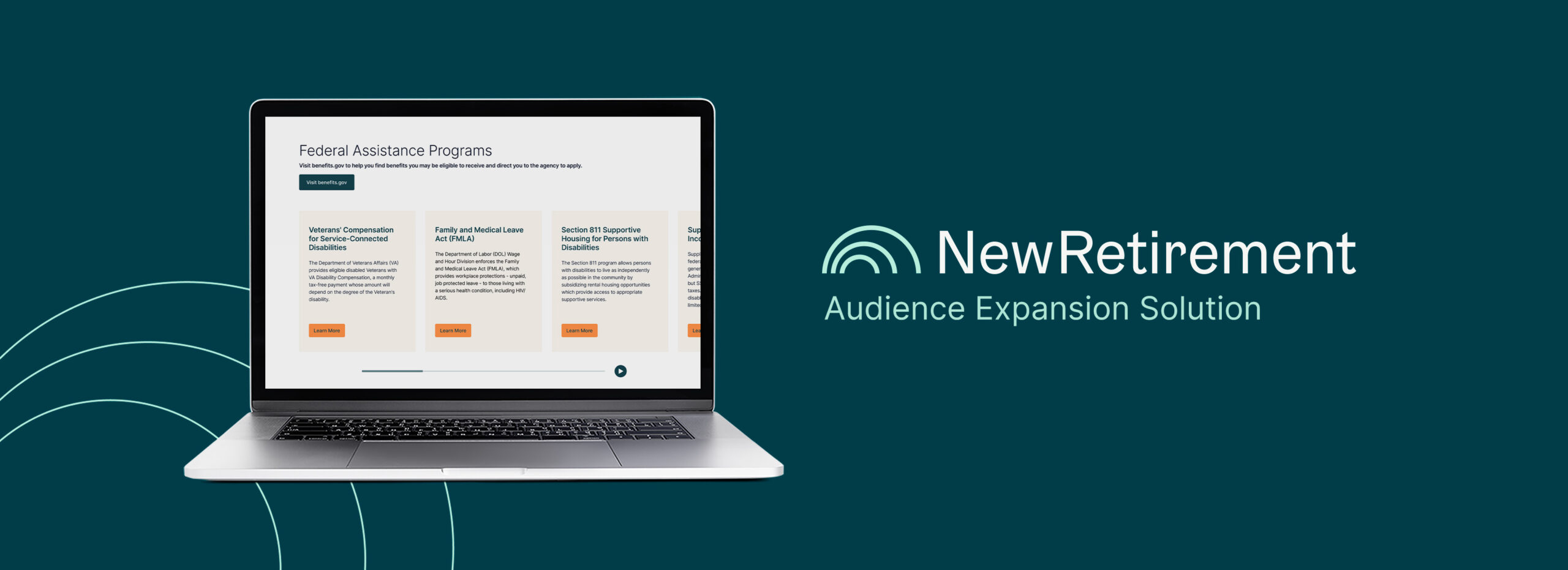
For a disabled NewRetirement user, they may not realize the federal assistance programs that exist for them. This carousel provides quick descriptions and links not as an exhaustive guide, but simply a reminder that these resources are out there.
In this section of the white paper, I compare statistics that highlight how having a disability can affect things like the amount you have in your savings, and your ability to pay for basic necessities.
This section visualizes the difference in income needed to obtain the same standard of living for households with an adult with a disability, and households without.
To finish out my white paper microsite, I included screenshots from the NewRetirement planner to give specific examples of how NewRetirement's tools can help someone with a disability manager their finances. I also included a call to action so that someone reading doesn't need to look any further to get started with their financial planning.
TAKEAWAYS
Data visualization should be approached on a case-by-case basis.
Not all data can be visualized in the same way. I tried out many different approaches for each set of data that I included in my white paper microsite.
Any type of content can be made into an accessible user experience.
The average user of NewRetirement may not be interested in reading a 50 page white paper analysis on the impact of disability on finances. My solution turns content that is usually dry and unapproachable into a modernized user experience that a wide range of people will want to interact with.
Designers must have an extensive knowledge of how disability affects the users of our products.
Through my research I learned that disability affects more than just financial planning. Many designers have a very limited understanding of what accessibility means, and this needs to change. Our products need to be accessible by default, not as an afterthought.
See more of my work

Digital IllustrationIllustration
Plant Parent Login StudyUI Design
No Kill MagazineSocial Media & Editorial Design

Ex-Tumblr GirlsBranding Design
AirOregon Design SystemVisual Design
